

table of contents
A well-designed landing page is often the critical difference between a visitor who bounces and a customer who converts. For e-commerce brands, these dedicated pages are powerful tools for launching products, promoting sales, and capturing leads with focused precision. Yet, staring at a blank canvas and trying to design a page that both looks great and drives sales can be a significant challenge. The best way to overcome this hurdle is to learn from those who are already succeeding.
This guide moves beyond generic advice to provide a curated collection of high-performing ecommerce landing page examples. We have meticulously analyzed pages from a variety of sources, from dedicated template builders to award-winning design showcases, to give you a comprehensive look at what works right now. Our goal is to equip you with the strategic insights and actionable takeaways needed to build your own conversion-focused pages.
Inside, you will find a detailed breakdown of each platform and example, complete with:
- Annotated screenshots highlighting key conversion elements.
- Deep strategic analysis of the “why” behind the design and copy.
- Specific, replicable tactics you can apply directly to your own projects.
- Direct links to explore the examples and platforms for yourself.
We’ve done the research so you can stop guessing and start building. By examining these top-tier ecommerce landing page examples, you’ll gain a clear understanding of effective layouts, compelling copy, and persuasive calls-to-action, enabling you to create landing pages that consistently turn traffic into revenue. Let’s dive in.
1. Shopify Theme Store
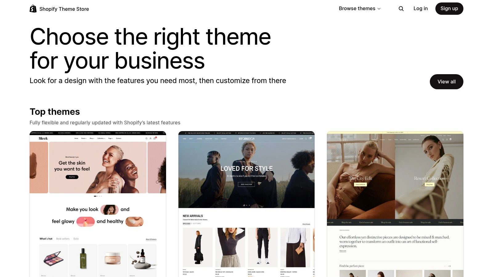
The Shopify Theme Store isn’t a single landing page but rather a powerful resource for finding high-converting ecommerce landing page examples and templates. For businesses building on the Shopify platform, it’s the official, first-party marketplace for themes that come pre-packaged with professionally designed landing page layouts for products, collections, and promotions. These themes are vetted by Shopify for speed, quality, and compatibility, eliminating much of the technical guesswork.
Instead of starting from scratch, you can browse dozens of live demo stores to see how different themes handle visual storytelling, product galleries, and calls to action. This makes it an invaluable research tool for understanding current design trends and effective user experiences.
Strategic Analysis & Key Takeaways
The primary advantage of using the Shopify Theme Store is the seamless integration. Every theme is built to work flawlessly with Shopify’s native features, including the inventory system, discount engine, and secure checkout. This native integration is a significant conversion asset, as it ensures a smooth, trustworthy path from landing page to purchase.
- Conversion-Focused Design: Themes are designed with commerce in mind. They often include built-in sections for testimonials, trust badges, countdown timers, and cross-sell/up-sell modules, all proven tactics for increasing average order value and conversion rates.
- Mobile-First Optimization: Shopify mandates that all themes are fully responsive and mobile-optimized. Given that a majority of ecommerce traffic comes from mobile devices, this is a non-negotiable feature for any modern landing page.
- Rich Filtering for Niche Needs: The store allows you to filter themes by industry (e.g., Fashion, Electronics, Home & Garden) and features (e.g., Quick Buy, Mega Menu, Sticky Header). This helps you find a template that already aligns with your brand aesthetic and functional requirements.
Key Insight: By starting with a purpose-built Shopify theme, you’re not just getting a design; you’re adopting a proven ecommerce framework. The landing page layouts within these themes have been tested and refined across thousands of stores, giving you a strategic head start.
How to Implement This Strategy
To leverage the Shopify Theme Store for your business, start by exploring the demo stores of themes that match your industry and catalog size. Focus on how their product and collection pages are structured. Pay close attention to the visual hierarchy, the clarity of the call-to-action buttons, and the overall user flow.
Most premium themes cost between $200 and $400, which is a one-time purchase per store that includes lifetime updates. While this initial investment is higher than some alternatives, it often pays for itself by reducing the need for costly custom development. For those just starting, the store also offers a selection of high-quality free themes. For more guidance on choosing the right design elements for your business, you can explore these small business website design tips from Net_Code_Design.
2. Webflow Templates + Showcase (eCommerce)
Webflow’s Template Marketplace and Showcase serve as a dual-purpose resource, offering both ready-to-use templates and a vast gallery of live ecommerce landing page examples for inspiration. For businesses that want complete design control without writing code, Webflow provides a powerful visual editor. Its marketplace is filled with professionally designed ecommerce templates that include layouts for product pages, promotional campaigns, and collection grids.
The Showcase, on the other hand, is a curated gallery of real websites built by the Webflow community. This allows you to see how other brands have successfully implemented unique interactions, animations, and layouts for their own ecommerce landing pages, providing tangible ideas you can adapt for your own store.

Strategic Analysis & Key Takeaways
The core advantage of Webflow is its unmatched design flexibility. Unlike more rigid template-based systems, Webflow gives you granular control over every element on the page, allowing for truly bespoke and brand-aligned landing experiences. This is especially valuable for brands with a strong visual identity that want to create an immersive, non-traditional ecommerce site.
- Total Creative Control: With Webflow’s visual editor, you can build custom interactions and animations that guide the user’s eye and tell a compelling brand story. This level of control is typically reserved for custom-coded websites, making it a major asset for creating memorable landing pages.
- Integrated CMS & Ecommerce: Webflow combines a powerful Content Management System (CMS) with its ecommerce features. This integration makes it easy to create dynamic landing pages that pull in product data, blog posts, and other content seamlessly, perfect for content-driven commerce.
- High-Performance Foundation: Webflow sites are known for clean code and fast load times, which are critical for user experience and SEO. Ensuring your pages are fast is a key conversion factor, and you can explore these Core Web Vitals performance tips for designers to further optimize your site.
Key Insight: Webflow empowers you to break free from the standard ecommerce template grid. It’s the ideal platform for building a unique digital storefront where the landing page experience is as carefully crafted as the product itself.
How to Implement This Strategy
To leverage Webflow, start by browsing the ecommerce templates to find a design that aligns with your brand’s aesthetic. Most premium templates cost between $49 and $129 as a one-time purchase. After purchasing, you can customize every aspect within the Webflow Designer.
Webflow’s ecommerce plans have different pricing tiers, with the Standard plan including a 2% transaction fee on top of Stripe/PayPal fees. Upgrading to a higher-tier plan removes this fee. While this may feel like a downside, the platform’s design capabilities often provide a return on investment through higher engagement and conversion rates, making it a strong choice for design-forward brands.
3. Unbounce (Templates + Examples)
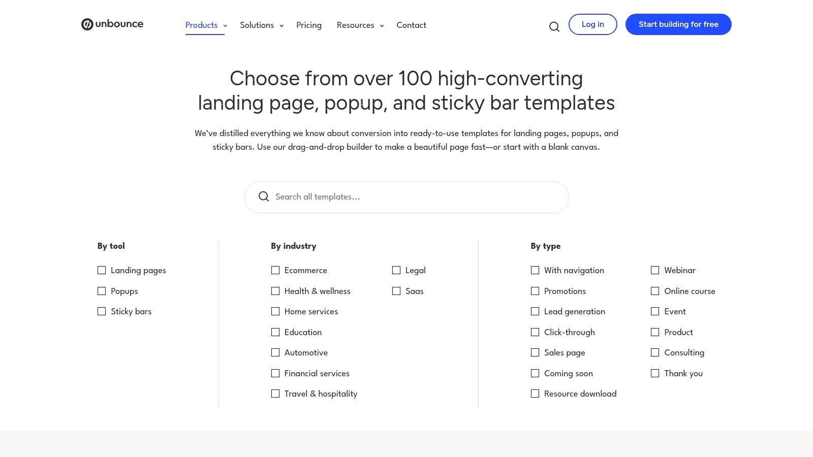
Unbounce is a dedicated landing page builder renowned for its focus on conversion optimization. While not a full ecommerce platform, it excels at allowing businesses to quickly create, test, and deploy campaign-specific ecommerce landing page examples without altering their main website’s code. It offers a rich gallery of professionally designed templates and a curated hub of real-world examples, making it an excellent resource for both inspiration and execution.
This platform is ideal for running targeted marketing campaigns, such as a new product launch, a seasonal promotion, or a lead magnet for a high-value item. Its drag-and-drop builder empowers marketers to act independently of developers, enabling rapid A/B testing and iteration to maximize conversions.
Strategic Analysis & Key Takeaways
The core advantage of Unbounce is its single-minded focus on conversion. Every tool and template is built to persuade a visitor to take one specific action. This makes it a powerful supplement to a standard ecommerce store, where a homepage has to serve many different purposes. Unbounce pages strip away distractions like site-wide navigation, focusing the user’s attention solely on the call to action.
- Rapid A/B Testing: Unbounce’s built-in A/B testing is its killer feature. You can easily duplicate a landing page, change a single element like the headline, button color, or image, and direct a percentage of your traffic to each version. The platform then tracks which variant converts better, providing clear, actionable data to optimize your campaigns.
- Decoupled from Your Core Site: Because Unbounce pages are hosted separately, you can experiment freely without risking your main store’s stability or performance. This separation allows for aggressive testing and campaign-specific designs that might not fit your overall brand theme.
- Conversion Intelligence Tools: The platform incorporates AI-powered features like Smart Traffic, which automatically sends visitors to the landing page variant they are most likely to convert on. It also includes AI copy generation to help overcome writer’s block for headlines and CTAs.
Key Insight: Using a dedicated tool like Unbounce allows you to treat landing pages as scientific experiments rather than static web pages. By isolating variables and testing hypotheses, you can systematically increase conversion rates for specific campaigns, directly impacting your bottom line.
How to Implement This Strategy
To get started, explore the Unbounce template gallery and its “Landing Page Examples” section to find layouts that align with your campaign goals. A 14-day free trial is available to test the builder and its features. Focus on creating a page for a single offer or product, ensuring every element supports the goal of getting the visitor to click “Buy Now” or “Add to Cart.”
Unbounce operates on a subscription model, with plans that have traffic and conversion limits. This makes it a recurring operational expense rather than a one-time purchase like a theme. However, for businesses running consistent paid ad campaigns, the ROI from even a small lift in conversion rates often justifies the cost. For an even more engaging page, consider these best practices for micro-interactions that feel magical from Net_Code_Design.
4. Leadpages (Template Gallery)
Leadpages is a dedicated landing page builder renowned for its extensive library of high-converting templates. While not a full ecommerce platform, it excels at creating standalone ecommerce landing page examples for specific campaigns, such as product launches, promotional offers, or lead generation funnels that warm up customers before sending them to a product page or checkout. It’s an ideal tool for businesses that need to rapidly deploy targeted, conversion-focused pages without altering their main website.
The platform’s strength lies in its simplicity and speed. Users can select from hundreds of mobile-responsive templates, customize them with a drag-and-drop editor, and publish a live page in minutes. This makes it perfect for running marketing campaigns that require unique, single-purpose landing pages designed to capture leads or drive a specific sale.
Strategic Analysis & Key Takeaways
The core advantage of Leadpages is its focus on direct-response marketing. Every template is engineered around a single call-to-action, minimizing distractions and guiding the user toward a specific conversion goal. Unlike a standard product page on an ecommerce site, a Leadpages page can be stripped of navigation, sidebars, and other elements that might pull a visitor away from the offer.
- Campaign-Specific Focus: Leadpages is built for creating dedicated presell or sales pages. This is perfect for driving traffic from paid ads (like Google or Facebook) to a highly relevant page that mirrors the ad’s messaging, which typically improves conversion rates.
- Built-in Conversion Tools: Many templates come with integrated features like countdown timers, pop-up forms, and clear CTA sections. The platform also includes A/B testing capabilities, allowing you to easily test different headlines, images, or button colors to optimize performance.
- Rapid Deployment: The no-code builder and pre-designed templates allow marketers to launch campaigns quickly without needing a developer. This agility is crucial for reacting to market trends or launching timely promotions.
Key Insight: Leadpages separates the “selling” environment from the “shopping” environment. By creating a focused landing page for a specific offer, you can control the narrative and user journey completely, making it an excellent tool for maximizing conversions on targeted traffic.
How to Implement This Strategy
To leverage Leadpages, start by identifying a single, clear objective for your campaign. Are you launching a new product, promoting a limited-time sale, or capturing email leads with a discount? Choose a template from the gallery that is designed for that specific goal. Customize the template with your branding, product imagery, and compelling copy that speaks directly to the audience you’re targeting.
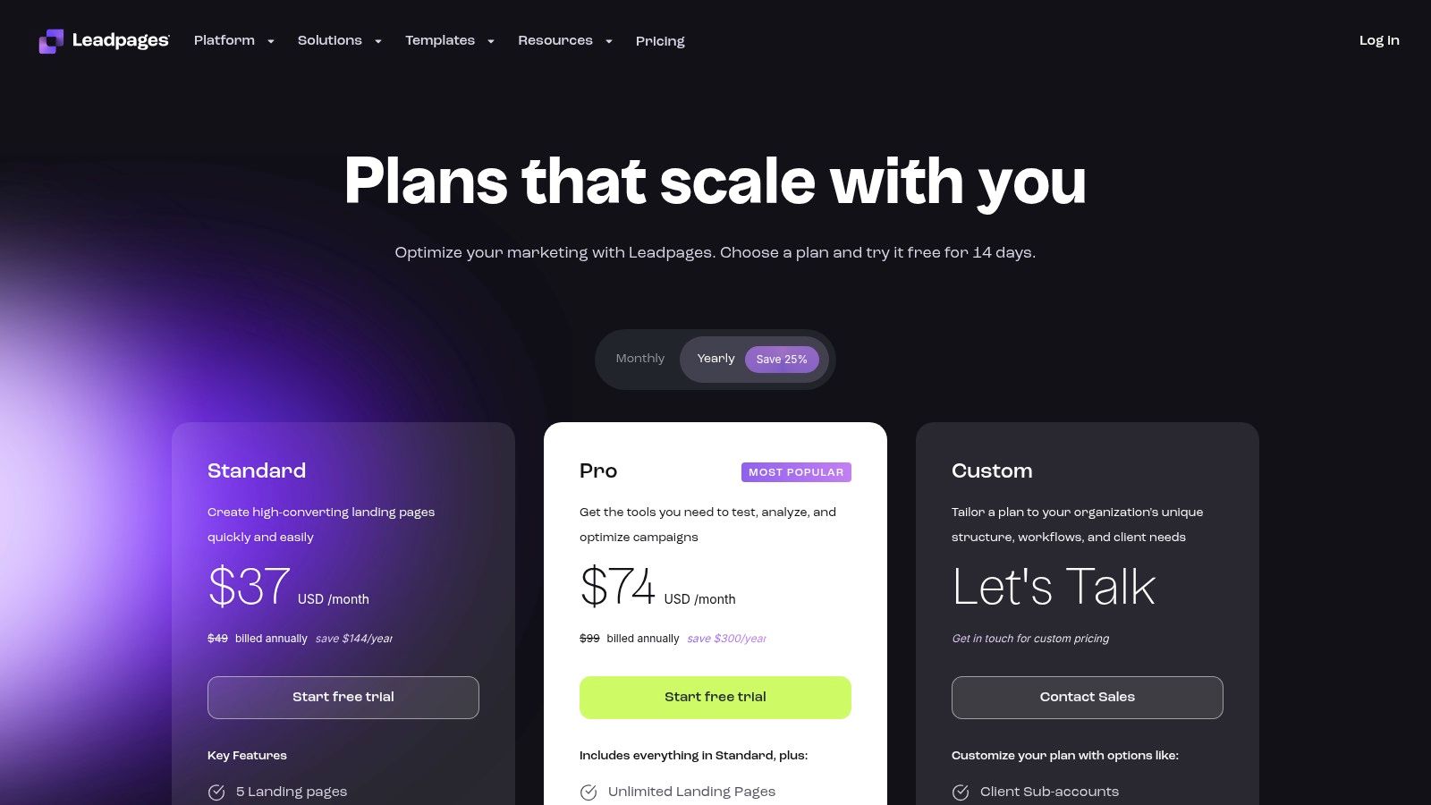
Leadpages offers a 14-day free trial, with paid plans that include unlimited traffic and leads. Standard plans typically start around $37 per month when billed annually. Since Leadpages isn’t a native ecommerce store, you will connect your “Buy Now” buttons to an external checkout, such as a Shopify product page or a Stripe checkout link. For more information on how to visually brand your page for maximum impact, you can explore tips on the psychology of website colors from Net_Code_Design.
5. ThemeForest (Envato Market)
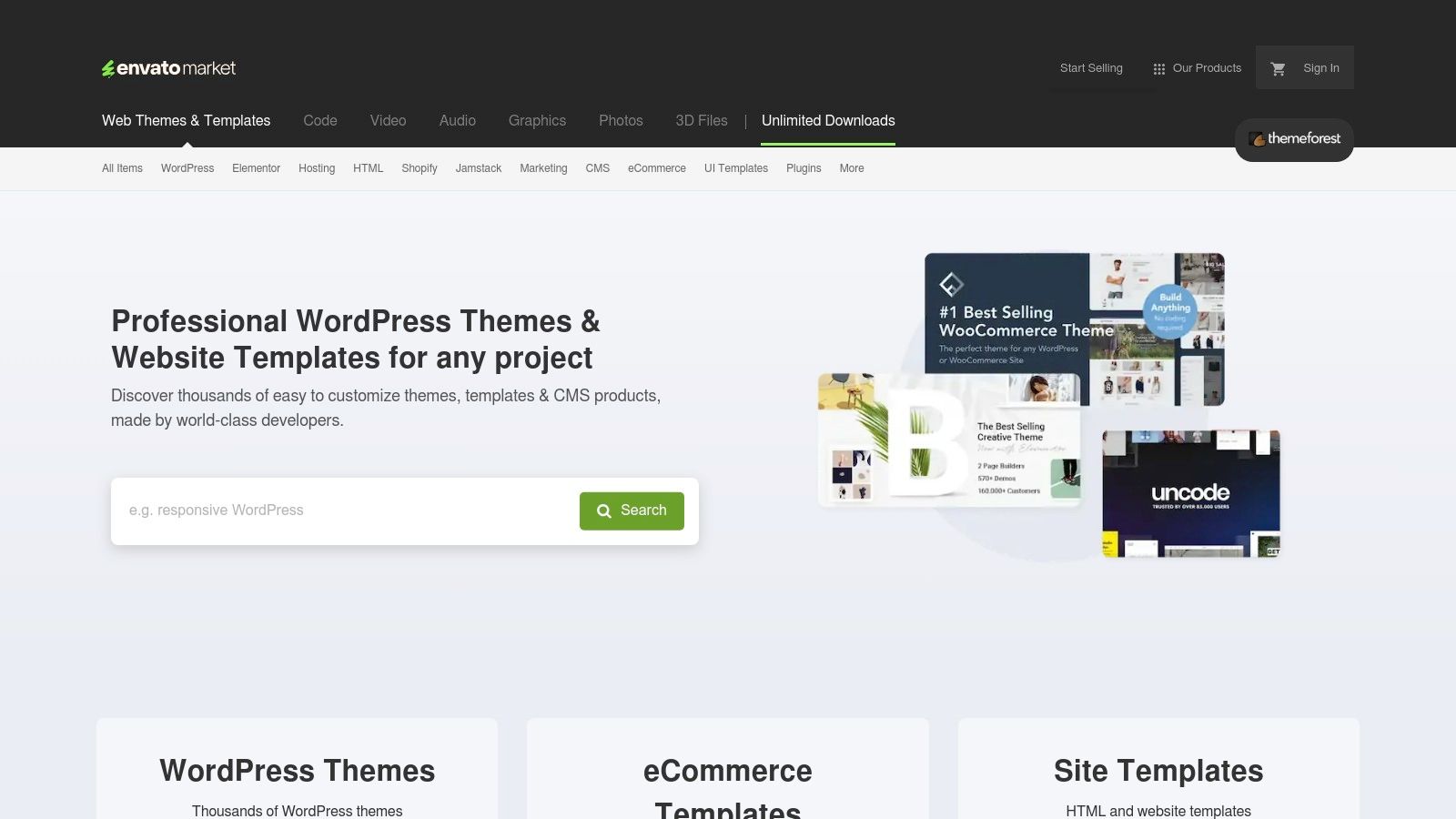
ThemeForest, part of the broader Envato Market, is a massive digital marketplace offering an enormous variety of themes and templates. While it’s not a single landing page builder, it serves as a vast library of ecommerce landing page examples for nearly every platform imaginable, including Shopify, WooCommerce, and standalone HTML. It’s an ideal resource for businesses that prefer a one-time purchase model over a recurring subscription and want access to a diverse range of design styles.
By browsing ThemeForest, you can preview thousands of live demos, gaining insight into different layouts, conversion tactics, and design trends from independent authors worldwide. This makes it a powerful tool for research and inspiration, allowing you to find a pre-built foundation that closely matches your brand’s vision and technical requirements.
Strategic Analysis & Key Takeaways
The core advantage of ThemeForest is its sheer volume and diversity. Unlike platform-specific marketplaces, it hosts templates for a wide array of content management systems and even static HTML/CSS, giving you maximum flexibility. This is particularly useful for businesses running on less common platforms or those wanting a custom-coded site without starting from scratch.
- Cost-Effective One-Time Purchases: Most themes are sold under a perpetual license, meaning you pay once and can use the theme for a single end-product indefinitely. This can be significantly more affordable long-term compared to subscription-based services, especially for businesses on a tight budget.
- Vast Platform & Niche Variety: Whether you need a hyper-specific theme for a WooCommerce-powered dropshipping store or a high-impact Unbounce landing page template for a lead magnet, ThemeForest likely has dozens of options. The extensive filtering system helps you narrow down choices by platform, features, and user ratings.
- Author-Driven Innovation: Because the marketplace is driven by thousands of independent authors competing for sales, you often find unique features and cutting-edge designs that might not be available in more curated, first-party theme stores.
Key Insight: ThemeForest decouples design from platform dependency. It empowers you to find a best-in-class design first, then implement it on your technology stack of choice, offering a level of freedom that platform-native marketplaces can’t match.
How to Implement This Strategy
To use ThemeForest effectively, rigorous vetting is crucial. Since quality can vary between authors, always check an item’s star rating, sales numbers, user comments, and the date of its last update. A well-supported theme will have a recent update history and responsive author support, which is typically included for the first six months.
Prices for ecommerce themes generally range from $29 to $99 for a one-time license. Before purchasing, run the live demo through Google’s PageSpeed Insights to test its performance. A beautiful design is useless if it’s slow to load. If you’re considering a significant visual overhaul, review a website redesign checklist from Net_Code_Design to ensure you cover all strategic bases. For broader access, Envato also offers an Envato Elements subscription, which includes a large library of themes and other creative assets for a monthly fee.
6. Awwwards – eCommerce Websites Gallery
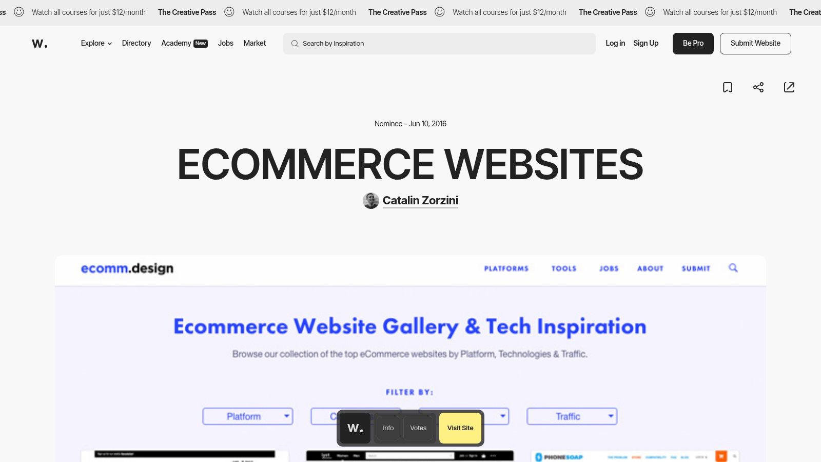
Awwwards is not a direct source for templates but an indispensable gallery of inspiration for businesses aiming for a premium, design-forward aesthetic. It’s a curated collection of award-winning websites, and its ecommerce section features some of the most innovative and beautifully crafted ecommerce landing page examples on the web. This platform is ideal for benchmarking what’s possible in terms of high-end user experience, interaction design, and visual storytelling.
For brands that want to stand out from template-driven competitors, Awwwards provides a lookbook of creative concepts. You can study how top-tier agencies and designers solve common ecommerce challenges, from product discovery to engaging checkout flows, which is invaluable when briefing your own design team or agency.
Strategic Analysis & Key Takeaways
The core value of Awwwards is its focus on creative excellence and execution. Unlike marketplaces, its purpose is to celebrate and showcase the best in web design. This makes it a powerful tool for ideation, helping you push beyond standard layouts to create a truly memorable brand experience that can justify a premium price point and build stronger customer loyalty.
- Cutting-Edge UX and UI Patterns: The sites featured often pioneer new interaction patterns, animations, and visual layouts. You can discover unique ways to present product details, handle navigation, and guide users through a purchase funnel that feels fresh and modern.
- High-Fidelity Visual Inspiration: Every example is of the highest visual quality. This is perfect for defining a brand’s art direction, creating mood boards, and ensuring that your own landing pages feel sophisticated and polished, which builds immediate trust with visitors.
- Detailed Filtering and Discovery: The gallery allows you to filter examples by industry, technology used (like Shopify or Webflow), and specific design tags (e.g., “Minimal,” “Typography,” “Photography”). This helps you quickly find relevant examples that align with your specific market and technical stack.
Key Insight: Awwwards is a strategic resource for raising your design standards. By studying how elite brands use custom design to communicate value and personality, you can identify opportunities to differentiate your own landing pages and create a more compelling, conversion-focused user journey.
How to Implement This Strategy
To use Awwwards effectively, browse the ecommerce websites gallery and save examples that resonate with your brand’s values. Don’t focus on copying an entire site; instead, deconstruct individual elements. Analyze how a specific product page uses video, how another site handles its typography hierarchy, or the unique call-to-action micro-interactions on a third.
Create a “swipe file” or mood board of these elements to share with your web designer or developer. This provides clear, visual direction that is far more effective than written descriptions alone. While the sites on Awwwards are often custom-built and expensive to replicate, the principles and creative ideas they demonstrate can be adapted to fit more modest budgets, elevating your project from good to great.
7. Lapa Ninja – eCommerce Landing Page Examples
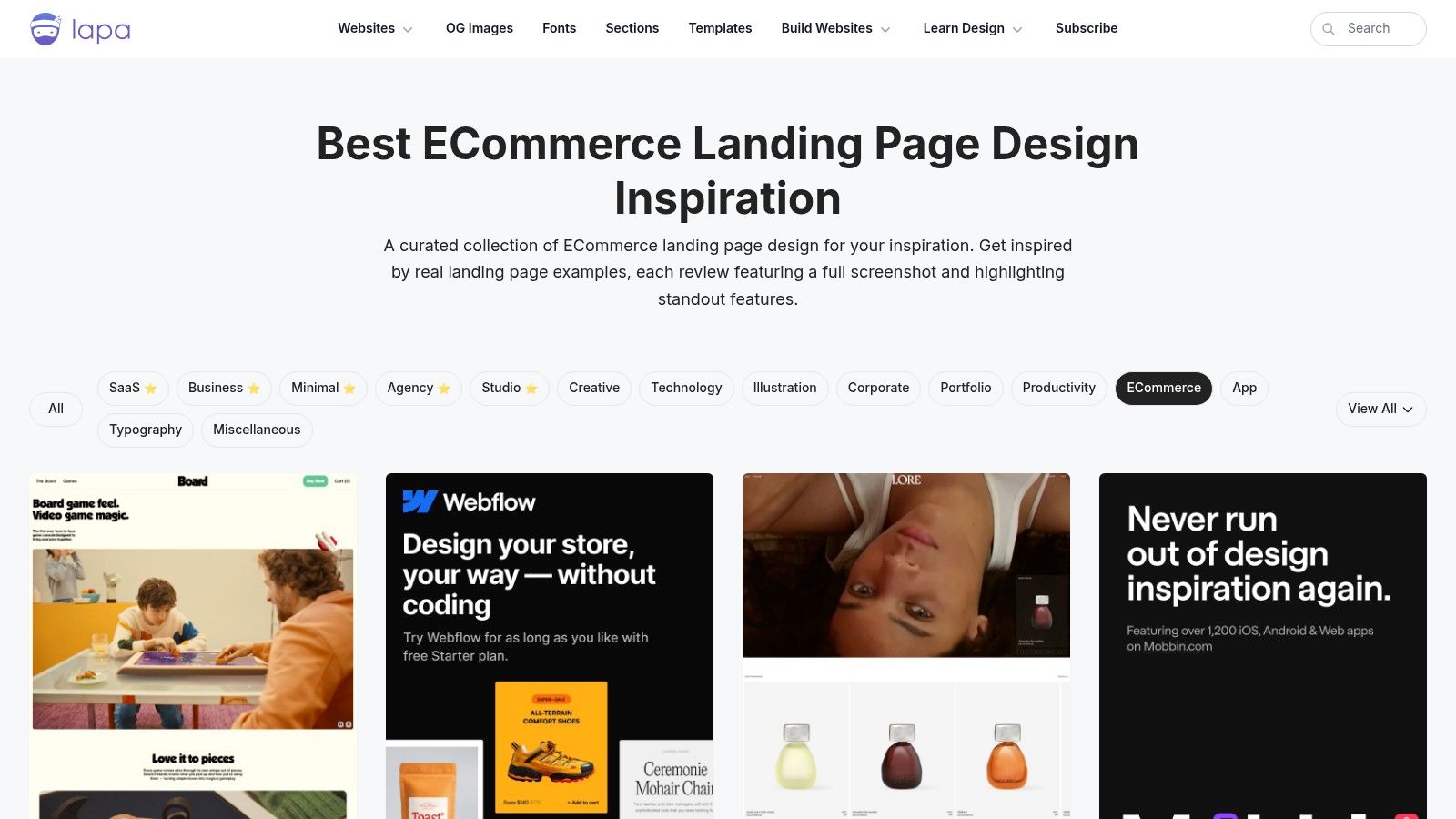
Lapa Ninja is a highly curated design gallery that serves as a treasure trove of inspiration for web designers and marketers. While it covers various categories, its dedicated ecommerce section features hundreds of modern, high-quality ecommerce landing page examples from real-world businesses. It’s an invaluable resource for building a “swipe file” of design ideas, understanding emerging trends, and seeing how different brands approach product presentation and conversion funnels.
Unlike a theme marketplace that sells templates, Lapa Ninja’s primary function is to showcase excellence in design. It provides full-length screenshots and direct links to live pages, allowing you to study the layout, copywriting, and user experience of successful online stores. This makes it an ideal starting point for brainstorming your own landing page design or creating a detailed brief for a web designer.
Strategic Analysis & Key Takeaways
The core value of Lapa Ninja lies in its curated, up-to-date collection. The platform is updated almost daily, ensuring you’re seeing the latest and most effective design patterns, not outdated examples from years ago. This focus on freshness helps you build a landing page that feels contemporary and trustworthy to modern shoppers.
- Wide Spectrum of Inspiration: The gallery features a mix of big brands and niche startups across various industries. This allows you to see how different budgets and brand aesthetics are translated into effective landing pages, providing more relatable examples than just looking at enterprise-level companies.
- Focus on Visual Hierarchy and Flow: By providing full-page screenshots, Lapa Ninja allows you to analyze the entire user journey on a page. You can easily dissect how top brands guide the user’s eye from the hero section and value proposition down to social proof and the final call to action.
- Practical Component Analysis: The gallery makes it easy to spot recurring elements, such as unique product photo layouts, interactive pricing sliders, or compelling testimonial formats. You can quickly gather ideas for specific sections of your page that need improvement.
Key Insight: Lapa Ninja accelerates the research and ideation phase of design. Instead of searching randomly, you get a filtered, high-quality stream of proven ecommerce landing page examples that you can deconstruct and adapt to fit your own brand and products.
How to Implement This Strategy
To use Lapa Ninja effectively, visit the ecommerce category and start filtering by sub-categories or colors that align with your brand. Don’t just look at the pages; click through to the live websites to experience them as a real user would. Take notes on how they handle navigation, micro-interactions, and the mobile experience.
Create a swipe file or mood board using screenshots of elements you like: a compelling headline, a clear pricing table, a well-designed trust badge section. Lapa Ninja is a free resource, making it an accessible first step for any business, regardless of budget. While some examples may link to paid templates, the primary value is in the free inspiration it provides for your own custom design or for customizing a pre-built theme.
A Comparison of Top Ecommerce Landing Page Sources
Here’s a summary of the platforms and marketplaces we’ve covered, highlighting their ideal use cases and key advantages.
Shopify Theme Store
- Ideal Use Case: Merchants on Shopify needing integrated landing pages.
- Key Advantage: Seamless native commerce features and vetted themes.
Webflow Templates + Showcase (eCommerce)
- Ideal Use Case: Designers and teams wanting full visual control.
- Key Advantage: Unmatched design flexibility and a showcase of live sites.
Unbounce (Templates + Examples)
- Ideal Use Case: Marketers running campaigns or A/B tests.
- Key Advantage: Powerful conversion tools and rapid deployment.
Leadpages (Template Gallery)
- Ideal Use Case: Quick launches for promos or lead generation.
- Key Advantage: Simple builder with funnel-optimized templates.
ThemeForest (Envato Market)
- Ideal Use Case: Buyers who prefer one-time purchases for various platforms.
- Key Advantage: Massive variety across different tech stacks.
Awwwards – eCommerce Websites Gallery
- Ideal Use Case: Designers and agencies looking for premium inspiration.
- Key Advantage: Curated examples of award-winning design and UX.
Lapa Ninja – eCommerce Landing Page Examples
- Ideal Use Case: Collecting swipe files and spotting current design trends.
- Key Advantage: Extensive, frequently updated gallery with live links.
From Inspiration to Implementation: Building Your High-Converting Ecommerce Landing Page
We’ve journeyed through a comprehensive gallery of exceptional ecommerce landing page examples, dissecting the strategies that make them so effective. From the robust, integrated themes on the Shopify Theme Store to the creative freedom of Webflow and the conversion-focused precision of Unbounce, the recurring themes are clear: clarity, trust, and a relentless focus on the user’s journey are paramount.
The examples showcased from Awwwards and Lapa Ninja prove that high-converting design doesn’t have to be formulaic. Instead, the most successful pages blend compelling visuals, persuasive copy, and an intuitive user experience to guide visitors seamlessly from interest to action. These platforms are not just repositories of pretty designs; they are strategic libraries filled with replicable tactics.
Key Takeaways for Your Next Landing Page Build
As you move from inspiration to building your own page, remember the core principles we’ve uncovered. Success isn’t about copying an example pixel-for-pixel. It’s about understanding the why behind the design and adapting those principles to fit your unique brand, product, and audience.
Here are the most critical takeaways to carry forward:
- Clarity Above All: Your value proposition must be instantly understood. Use a powerful headline, a concise sub-headline, and a hero image that immediately communicates what you offer and for whom.
- Trust is Non-Negotiable: Social proof is your most powerful asset. Integrate customer reviews, testimonials, trust badges (like payment options and security seals), and user-generated content to build credibility and reduce purchase anxiety.
- The CTA is King: Your call-to-action must be singular, specific, and visually prominent. Use action-oriented language and contrasting colors to ensure it’s impossible to miss. Avoid multiple competing CTAs that dilute focus.
- Mobile-First is Mandatory: The majority of ecommerce traffic now comes from mobile devices. Your landing page must not just be “mobile-friendly”; it must be designed with the mobile experience as the top priority, featuring thumb-friendly buttons and scannable content.
Choosing the Right Tool for the Job
The tools we explored each serve a different purpose, and selecting the right one depends entirely on your team’s skills, budget, and specific goals.
- For Beginners & All-in-One Solutions: Shopify and Leadpages offer the most straightforward path. Their template-based approach removes technical barriers, allowing you to launch a professionally designed, conversion-ready page quickly.
- For Designers & Creative Control: Webflow is the ultimate choice for those who want complete design freedom without writing extensive code. It’s perfect for creating bespoke, highly-branded ecommerce experiences.
- For Data-Driven Marketers: Unbounce is built for performance. If your primary goal is A/B testing, rapid iteration, and maximizing conversion rates through data, its powerful features are unmatched.
- For Budget-Conscious Exploration: ThemeForest provides a vast, affordable marketplace for templates. It’s an excellent starting point if you have development resources and are looking for a cost-effective design foundation.
Before you commit to a platform, ask yourself: What is my primary goal? Is it speed to market, creative expression, or rigorous optimization? Your answer will point you toward the ideal tool. Remember that even the best ecommerce landing page examples are the result of a thoughtful strategy, not just a slick template. Use the inspiration you’ve gathered here as a strategic blueprint, not just a visual guide. Your next high-performing landing page is waiting to be built.
Feeling inspired by these ecommerce landing page examples but need an expert partner to bring your vision to life? At Netco Design LLC, we specialize in creating custom, conversion-focused ecommerce websites and landing pages that not only look incredible but are engineered to drive sales. Contact us today to discuss how we can build a powerful online presence for your brand.

